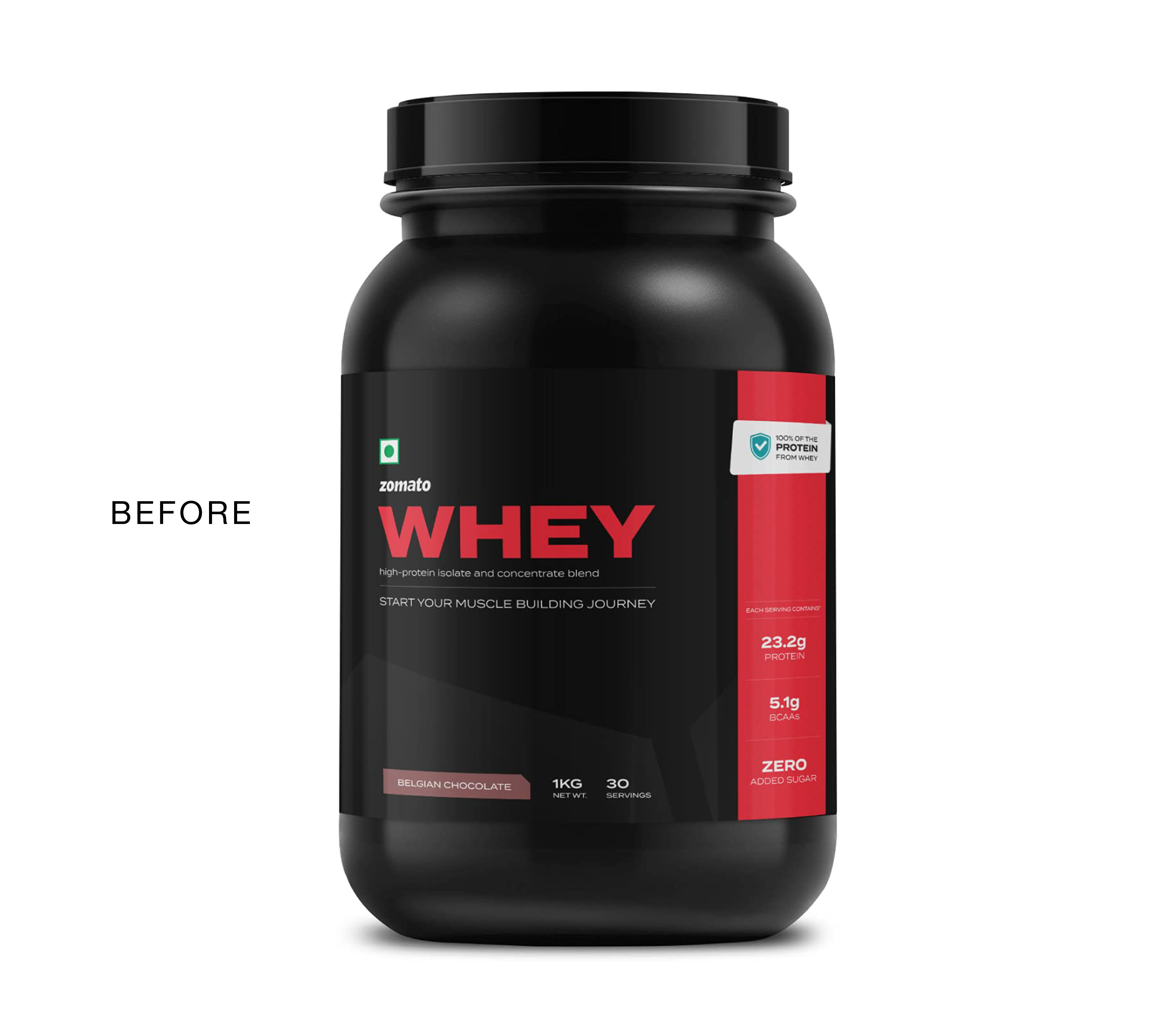
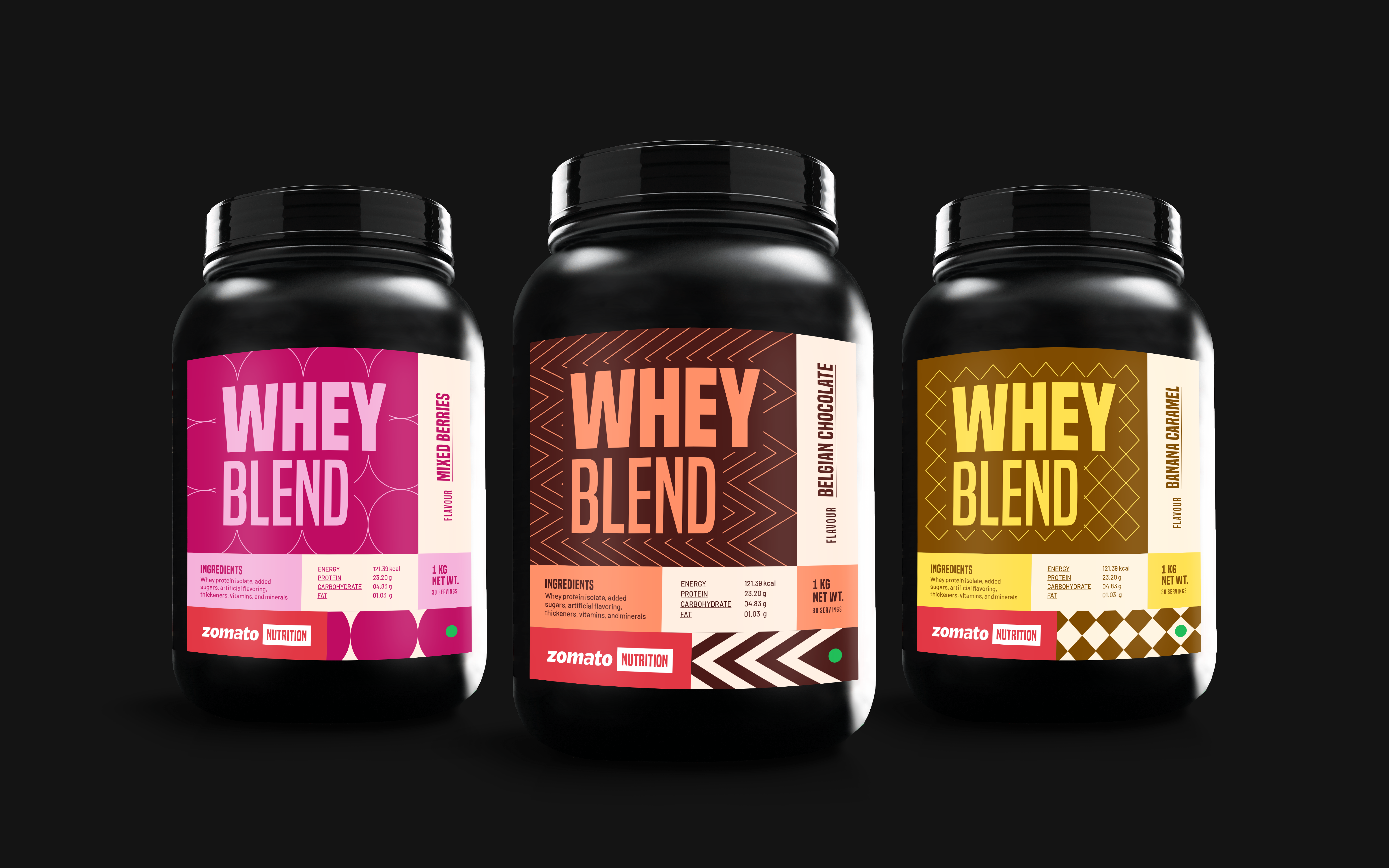
In 2022, Zomato was selling Premium Whey as a part of their offerings on the app. The current design was created by their product deigners who mostly ended up working on packaging projects, without much expertise in it. Zomato also planned on adding more flavours.
As a result, the product packaging only emphasised the generic name and did not do much to add to the experience. Considering that its marketing was limited to just having a designated space on the app, the packaging had to do some heavy lifting.
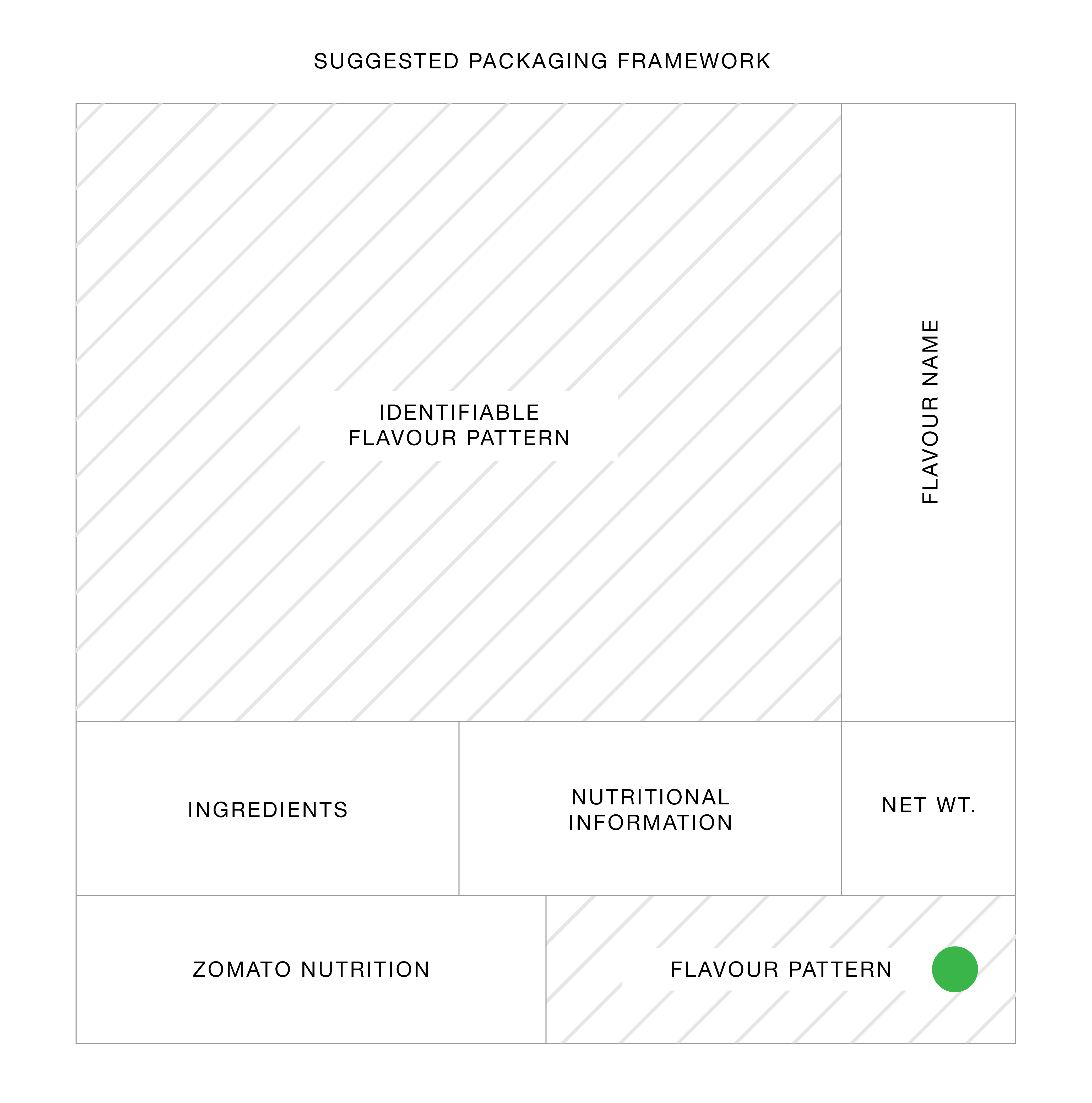
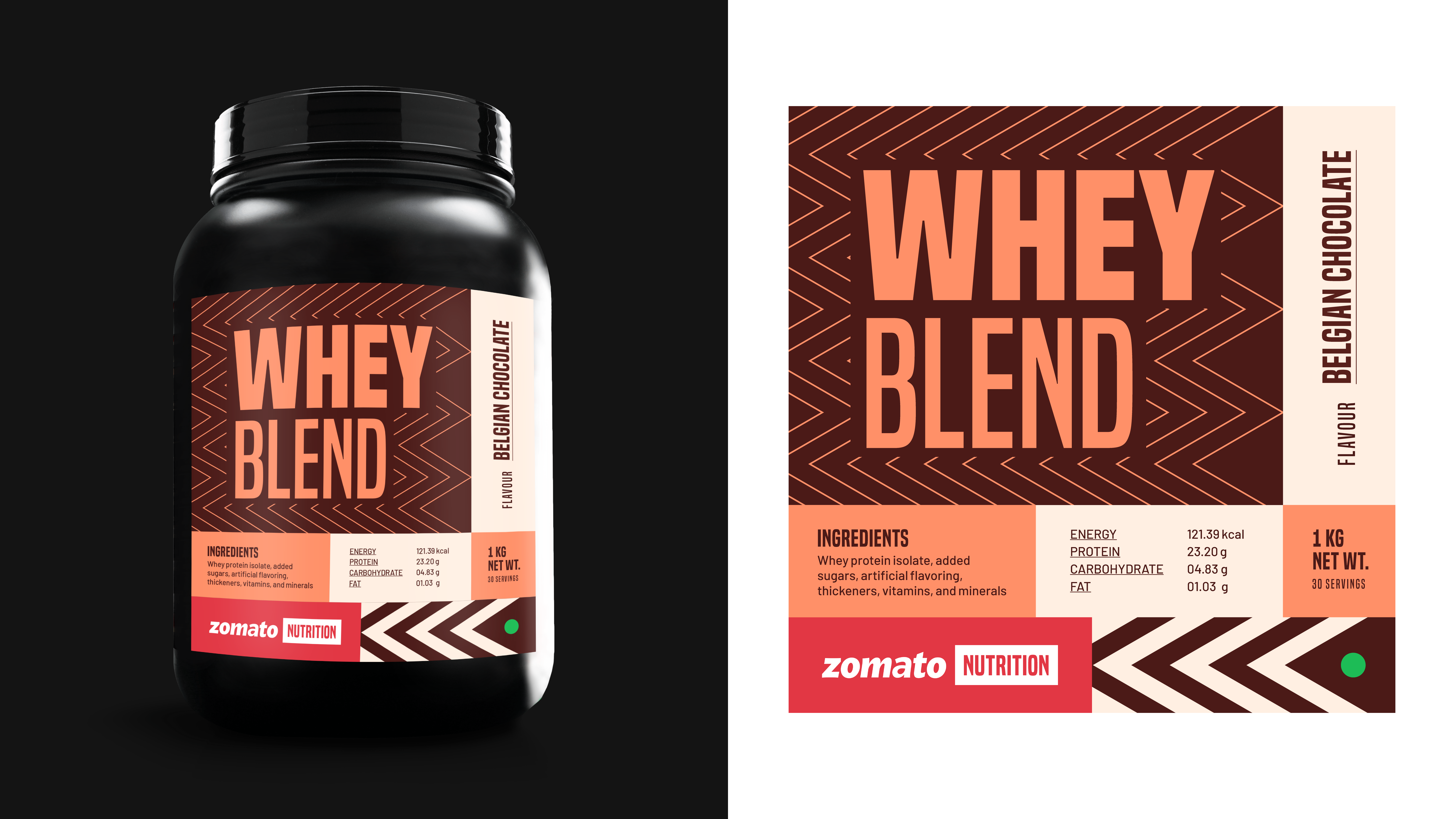
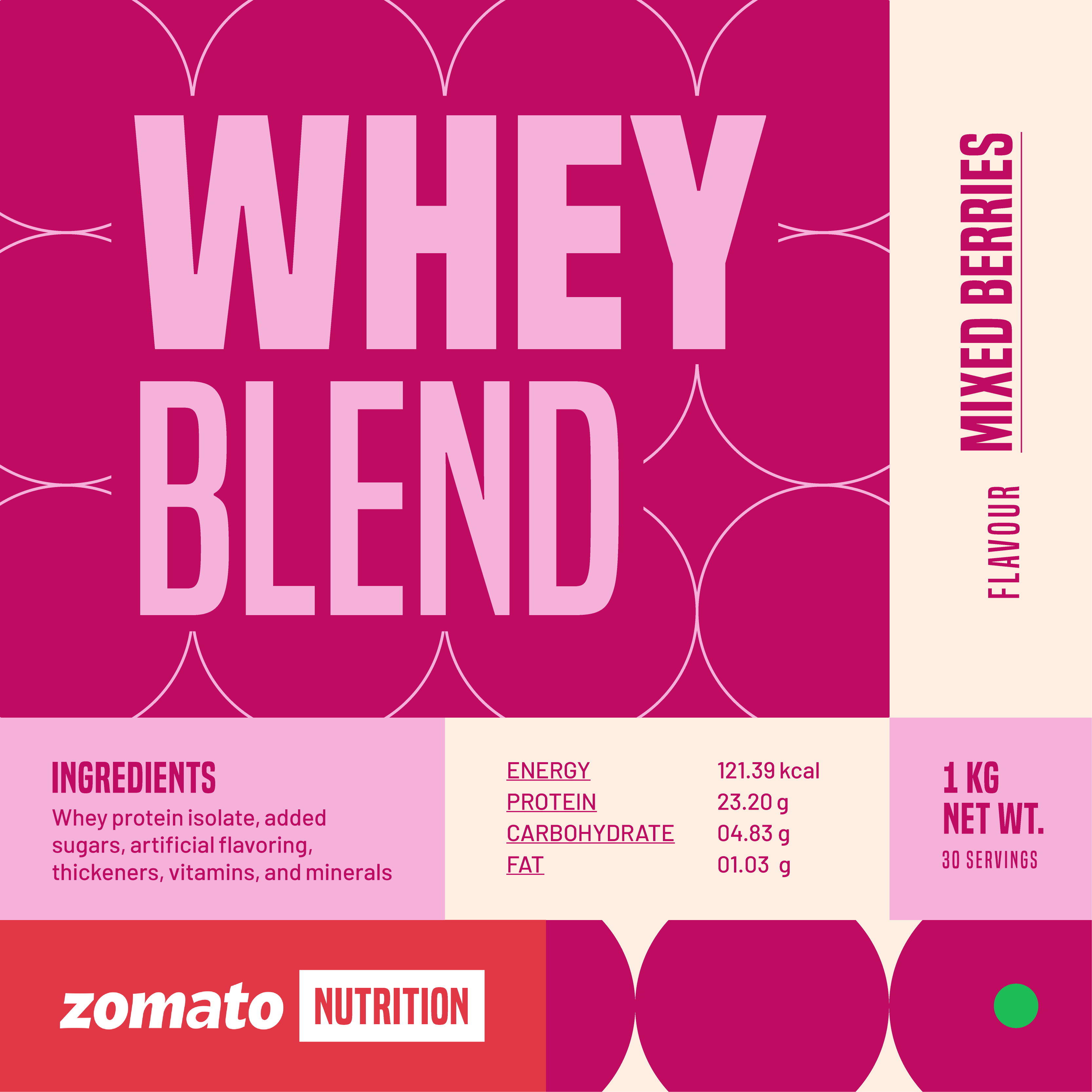
Keeping the above in mind, the new alternative design is a system that is simple yet adaptable. It’s created in a way that designers with experience in UX/UI can easily carry it forward.
As a result, the product packaging only emphasised the generic name and did not do much to add to the experience. Considering that its marketing was limited to just having a designated space on the app, the packaging had to do some heavy lifting.
Keeping the above in mind, the new alternative design is a system that is simple yet adaptable. It’s created in a way that designers with experience in UX/UI can easily carry it forward.
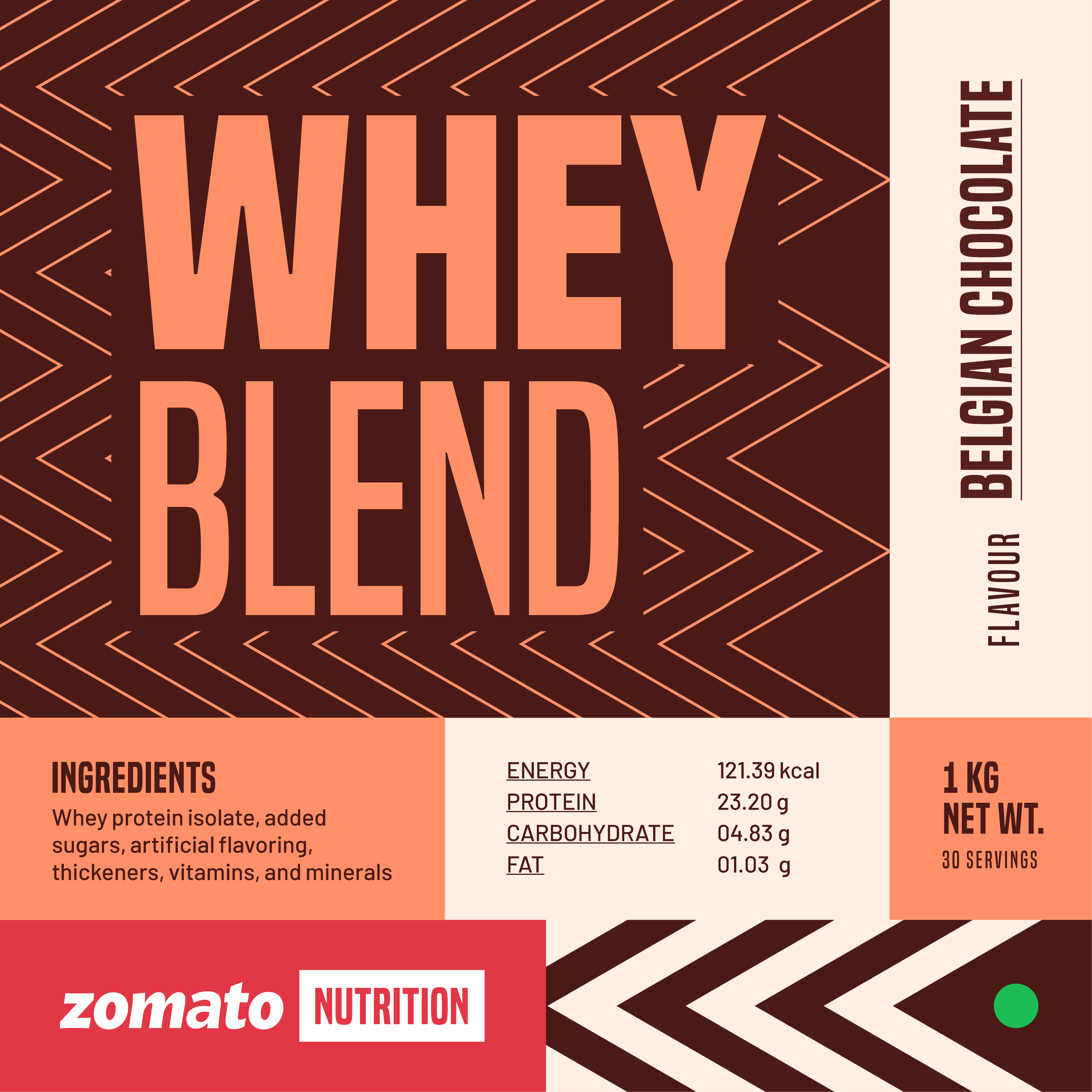
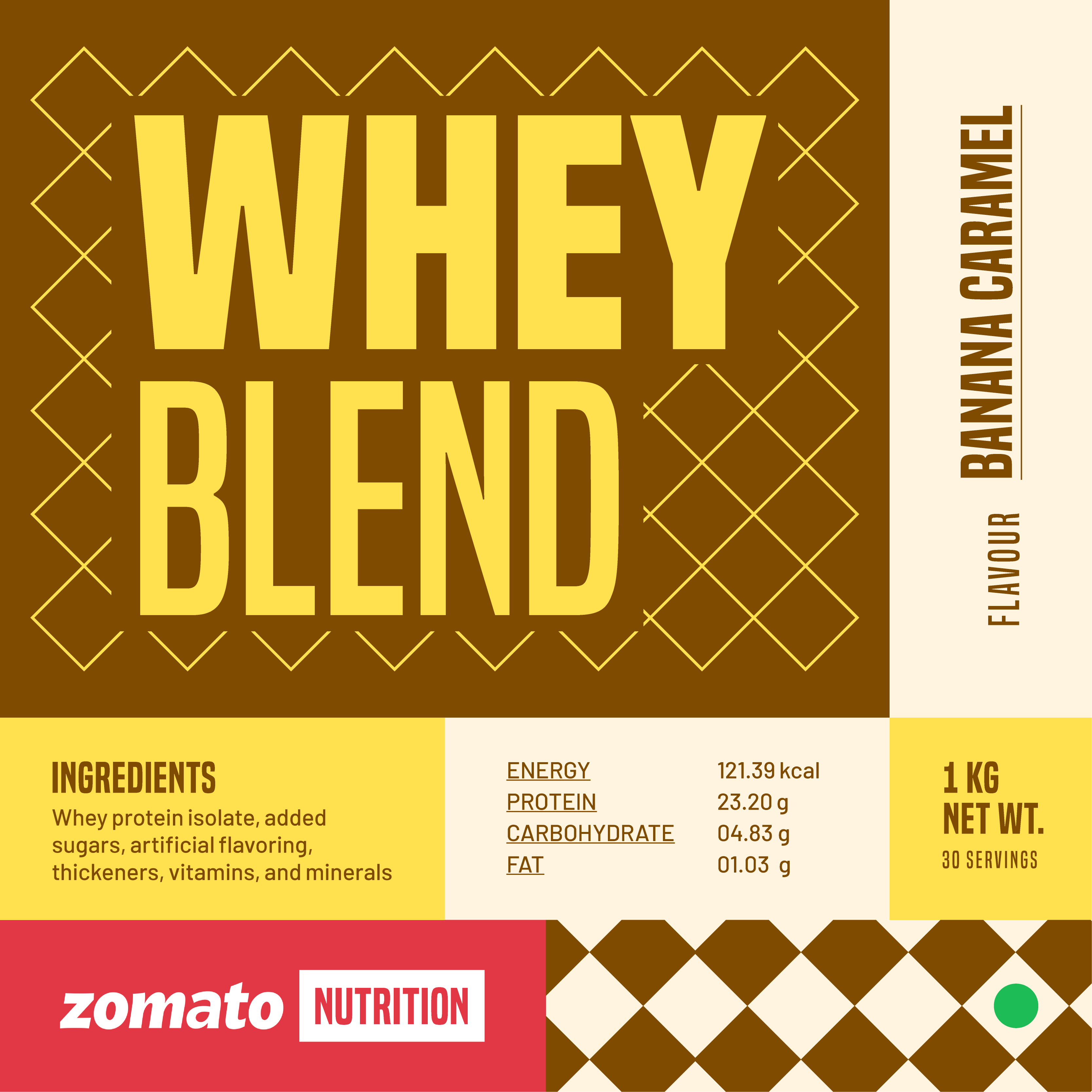
Specific updates the label needed:
- Zomato is a food delivery app, and food delivery is not always healthy. Introducing ‘Zomato Nutrition’ as a parent sub-brand, versus keeping it under the zomato umbrella would help engage the right audience
- Keeping the label flavour specific. This would add to its appeal and help differentiate existing flavours even when someone glosses over
- For a health/ fitness product, introducing the ingredients and nutritional information upfront on the pack also helps earn trust
- In India, where a large number of people are conscious of their diet preferences, the vegetarian symbol also needed to be upfront